
APACHE AMBARI, as part of the Hortonworks Data Platform, allows enterprises to provision, manage, monitor and secure Apache Hadoop clusters.
AMBARI is one of the most popular tools in operating Hadoop clusters.
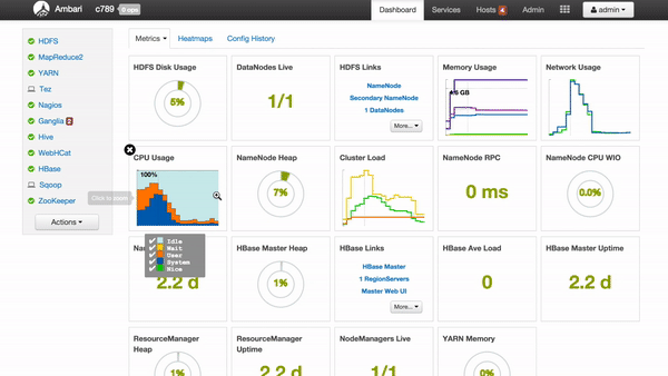
The Dashboard is Ambari’s Home page for
Hadoop operators to monitoring their clusters.
Team:
OVERVIEW
What is AMBARI ?
Ambari provides an intuitive, easy-to-use web UI allowing users to manage Hadoop effortlessly. In other words, Apache Ambari takes the guesswork out of operating Hadoop.
The Dashboard is Ambari’s Home page and it should allow users to detect the problems intuitively and monitor the status of their clusters easily.
.jpg)
How we manage Hadoop clusters without Ambari
What is "The Original Version" looks like?
"It took me 30 mins before realizing the cluster was broken!"

Original Version of Dashboard
Services (such as HDFS, YARN .etc) are the main components of a Hadoop Cluster, the operator should be able to monitor the status of all services on Dashboard in order to take action if there was something wrong.
In the original version, services status is displayed in texts and hidden in tables, not readable at all.
Therefore, the design goal is to visualize those data, providing intuitive UI to monitor the status of the cluster in a second. Just like the dashboard of a car.
INTO THE DESIGN
How to Visualize the texts?
"HDFS: 5.1% Capacity Used, NameNode Uptime: 2.2 day ......."
Texts were categorized into 4 types: Gauge, Number, Links, and Graph. It is a better way to show them in the tiles below than in plain texts.
To enhance Customizable Tiles:
As for Gauge and Number type, colors are fully customizable. For example, you could set the gauge color red if the percentage is above 90%.
All Tiles are moveable on dragging and dropping.

How about the layouts?

"Sometimes, less is more."
Eventually, the third one was chosen after several rounds of iterations. We aimed to make all the tiles movable on dragging and dropping. Therefore, the third option would make the layout clear no matter how you organize them.

INTO THE DETAILS
Hovering Effects
Tiles are more intuitive than plain texts, but lack of details.
So I show more information on mouse hovering such as descriptions and actions .


Video recording from live clusters.
Jump to a new page on clicking a link.
As for a Graph tile, simply click to zoom in the graph.

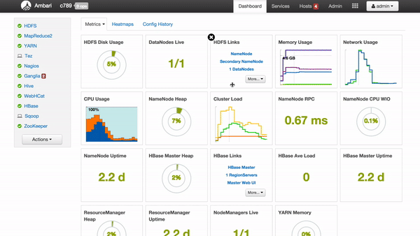
Customize Tile Colors
To be able to customize the color of Tiles is a major feature in the design. With this feature, the operator can easily detect issues about the cluster in a second, in order to solve the issue as soon as possible.

"A red gauge indicated something wrong about my cluster."


In the demo above, the operator could define the color range of a Gauge or Number Tile. Once data reached the danger zone, the Tile will change to Orange/Red immediately.
IT'S A LONG-TERM STORY
The version of Ambari with new Dashboard was released in June 2014. Ambari took a lot of credits from customers based on this new Dashboard feature.
Until 2016, we have a UX designer to work with me, so we made a new side menu for Ambari to bring it to the next stage.
I'm so glad how much I've learned through this project. As a developer, I could implement my own designs. While as a designer, I made contributions to refreshing Ambari and gained credits from customers.
Original Version of AMBARI
2013

AMBARI 1.6
2014


AMBARI 2.4
2016 - now
Other designs & deliveries for Ambari

Ambari: Alerts Page
THANKS FOR READING
