Neiman Marcus:
iOS App Redesign
Sep, 2017

OVERVIEW
Neiman Marcus, is an Ameican Flagship department store which is among the most prestigious luxury stores. The company operates 42 Neiman Marcus stores across the United States, primarily offers women's apparel, accessories, and home furnishings.
PROJECT
01. THE CHALLENGE
Although Neiman Marcus is one of the most popular luxuries stores in the US, its iOS App is barely satisfactory. E-Commerce markets are growing fast today, Neiman Marcus should attract a larger market share if investing an effort to redesign and rebuild their App. I am a shopaholic and this is a design challenge I want to try for a long time.
02. RESEARCH & ANALYSIS
Destructing the problems and making them feasible and concrete is crucial in this business design challenge. In order to scrutinize the product with a better understanding of the user pain points and insights, I conducted two methods of research: Heuristic Evaluation and User Reviews Analysis.
THE ORIGINAL VERSION
Heuristic Evaluation

Top Menu
Home
Main Menu
Products & Filter
Product Details
Neiman Marcus App Version 8.4, released on Sep 5, 2017
Well, what do you think?
After scrutinizing the UI/UX of Neiman Marcus app in version 8.4, I come to the evaluation conclusions:
Chaotic architecture, Poor searching and filtering functions, outdated UI styles conducted bad shopping experiences, not enjoyable at all.
1. Home: Infomation overloaded.
It's hard to draw users' attention to featured sale or promotion.
2. Menu: Intricated Navigation
Disordered Navigation with an overloaded left menu and an annoying top menu.
3. Products List: Not Visible
The top menu and filter stays on scrolling, left a relatively small area to view products.
Poor filtering and sorting functions.
4. Product Details: Lack of unity and succinctness.
USER REVIEWS ANALYSIS
App Store Reviews
"A very low-end App from a high-end store"
2.5 / 5
(214 Ratings)

"Absolutely horrible compared to Saks, Net-a-porter and Barneys"
"Loading is extremely slow"
"Clunky Interface, like their mobile website."
"This App fails in terms of ease of use, design, and purpose"
"Keeps crashing. Frustrating!"
"I've waited so long hoping to see an improvement. Didn't happen!"
"Get rid of the pestering elements, plz"
Hmmm, however, there are still 40% of positive reviews, should we ignore those? Based on my analysis, the positive reviews could be ascribed to the following two reasons:
1. Tolerant. Lots of customers show their tolerance to the App because of the good in-store shopping experiences and their long-time trust to the company.
2. Too General. General thumbs-up with only a few words and no details.
However, the negative reviews are full of customers' emotions and shopping details. Apparently, they are quite valuable and worth analyzed thoroughly.

Affinity Diagrams

Raw data notes from 100+ negative reviews

Data clustered into thematic groups
Dealing with tons of data and information from the negative reviews, I clustered data notes into thematic groups and finally narrowed down to 4 tangible problems:

1. UI Styles: clumsy and outdated
Non-contemporary and clumsy UI designs effect on the entire user experience either browsing finding or buying products.
Customers will definitely purchase more with a better designed and well organized App.
2. Navigation: disorganied
Top placed Message box incurs lots of complains about the annoying and useless messages. The clunky homepage is full of sections which should be placed in the navigation. New features such as Camera Search and "Flip to Find" were hidden in the dazzling navigation.


3. View and Buy: poor functions
Poor designed Searching/Filtering/Sorting functions made it difficult to find products customers want. Sold-out item is not marked in the products list. Product details page needs cleanup to prioritize important info.
4. Back End Server: errors, slow and not synchronized
Errors: App crashes constantly during any scenarios. This is the worst case and got the most complaints. Error msg keeps popping up telling non-instructive info.
Slow: loading products and shopping bag slowly made customers frustrated.
Not Synchronized: shopping bag, credit card info cannot be remembered.

Problems
03. IDEATION & SOLUTIONS
Understanding target customers are always crucial for problem-solving. A better understanding of users could help better transforming them into business value. Considering Neiman Marcus has a tremendous user set, according to my research analysis from the reviews in App store, I categorized users into three types based on their motivations, purposes, and needs when shopping with the App.
Meet The Customers
PERSONAS

Miranda
42, CFO
3000+ budget
A luxury amateur who would spend 3000+ on luxury purchasing every month. She is busy and typically shop in the store. She used to View products and save in wishlist with App when she is relaxed.

Savi
30, Art Director
1500+ budget
Fashion insider who loves and follows the fashion trend. Lives far from NM stores, purchasing fashion needs online all the time. She would use our App anytime and anywhere.

Jane
24, Accountant
500+ budget
Fashion rookie who seeks fashion trends or promotions from NM App. Jane has a relatively tight budget and always compare prices before purchasing a product.
Well, who has the potential to purchase more?
Here I have an interesting question for you, whose buying potential will be increased most if we have improved the entire User Experience of Neiman Marcus App?
My answer is Savi. Why?
Miranda is mostly occupied by in-store events, she has great loyalty to NM and her favorite salespeople in the nearest store. In other words, she doesn't care much about the App design.
How about Jane? Let's say we improved the App experiences and made it easy for Jane to find lots of charming items, she still needs to compare prices with peers. Eventually, she will buy the product from the retailer offering the lowest price.
Savi is different! Savi is in her 30s and is building loyalty with retailers in her own flavors. Savi would buy more if NM is one of her favorite retailers. Therefore, if we could catch Savi's attention and cater to customers like her, the possibility of selling more can be predicted!
With the insights from the personas, the solutions to the problem statements from the user research are generated as below:

PROBLEMS
1. UI Styles: clumsy and outdated
2. Navigation: disorganied
3. View and Buy: poor functions
4. Back End Server: errors, slow and not synchronized
SOLUTIONS
1. Simplify UI. Considering font types, colors, font sizes and Savi's taste (contemporary)
2. Restructure Navigation. Reorganize and group menu items. Clean up redundant ones.
3. Improve filtering, sorting and searching functions
4. Comfort customers slow loading. Provide meaningful instructions about errors.
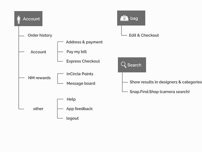
Based on the solutions diagram above, I evaluate the specific goals and expectations of each group of target users. In this process, Savi's tastes and expectations lead the main design while the design also meet Miranda and Jane's requirements. Eventually, I restructure the information architecture as below:
Information Restructure


04. UI DESIGN


Start Shopping Easily
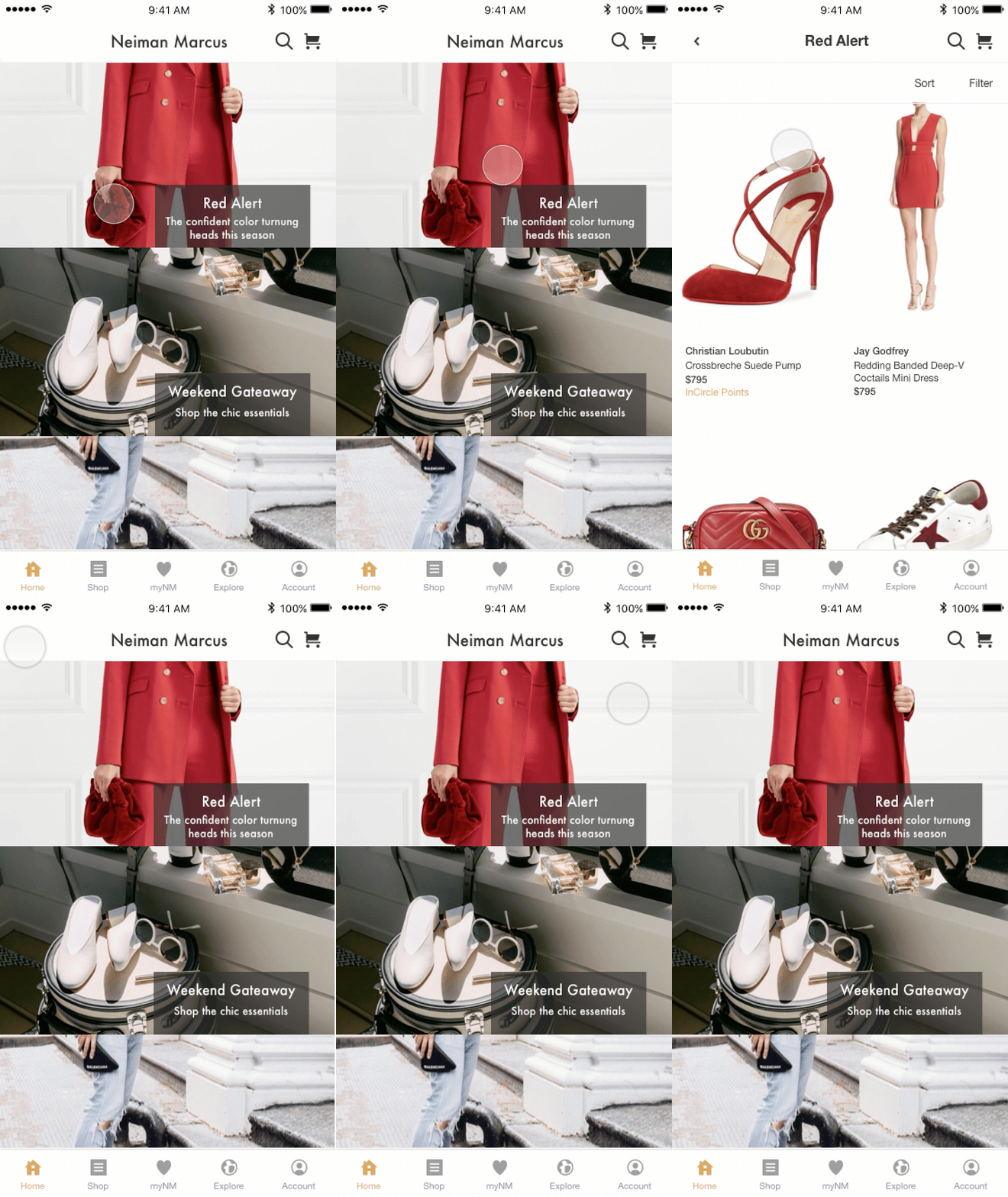
EXPLORE
Get inspirations from Neiman Marcus Instagram or our fashion magazine: The book.


myNM
Find your favorite items here, moreover, we picked products just matched your style!
SHOP
Shop from Categories or Designer list.

HOME
Browse featured sales event, find the latest fashion trend in a minute.

Browse Products Smoothly

PRODUCTS LIST
Entering any shopping start point, you come to the product list page.
On scrolling up, Sort & Filter Bar will disappear, and show again on scrolling down.

PRODUCT DETAILS
Regrouped and clarified the information.

FILTER
Refine & Search Freely
SORT

SEARCH
-
Simply enter the keywords, and select from the search results in Designers and Categories.
-
Recent search history would display on entering search page
-
Camera Seach is also enabled.

Manage Account

ACCOUNT
.Get access to your account at one place
05. IDEAS OUTSIDE THE SCOPE
Beyond the design, I want to share some ideas to extend the Neiman Marcus brand values and business opportunities.
1. Cooperate with fashion bloggers
Invite famous fashion bloggers or celebrities to create a featured collection of trendy clothing, bags, and accessories. Bring NM to the scope of contemporary fashion taste.
2. Improve product demonstration
A luxury apparel cost $1000 looks like a $100 piece of a cheaper brand on the NM App and website. Please consider investing more in photographing and styling each product, how it looks is everything for e-Commerce business.
3. Care about customer's thoughts
During my analysis of NM app store reviews, there are many calls for the App improvements which were totally ignored. The marketing department is working hard to stimulate user growth, meanwhile, should we pay attention to those user losses?
THANKS FOR READING
